Our Favorite Cabinetry Paint Colours
A fresh coat of paint is one of the quickest and most powerful ways to transform a space in your home. And while walls often get the spotlight, cabinetry deserves just as much attention. Cabinets take up a significant portion of a room — especially in kitchens, living rooms, and mudrooms — which means the color you choose sets the tone for the entire space.
At Suits & Sawdust, we’ve designed custom millwork and cabinetry across Ontario — from modern condos in Toronto to timeless family homes in Burlington, Oakville, and beyond. We’ve learned firsthand how much impact the right paint can have. Bold or classic, moody or light, cabinetry colors carry the power to completely change not just the look of a room, but the way it feels.


There are all sorts of directions you can take — natural wood tones that bring warmth and texture, crisp whites that feel airy and clean, or deep, moody colors that make a dramatic statement. Whether your style leans traditional, modern, or somewhere in between, the paint you choose becomes the foundation of your cabinetry design.
Here are a few of our favorite cabinetry paint colors that we keep coming back to:
Chantilly Lace by Benjamin Moore
When it comes to crisp, clean whites, Chantilly Lace OC-65 is the one we keep reaching for again and again. It’s bright without feeling sterile, and it has just enough warmth to avoid looking stark, even in natural light. Think of it as the “true white” that plays well with any palette — a timeless backdrop for both modern and traditional designs.
On cabinetry, it brings a fresh, airy feel that instantly makes a room look larger and lighter. We love using it in kitchens for a classic, polished look, in laundry rooms where brightness matters, or on built-in shelving to let décor and styling shine. The beauty of Chantilly Lace is its versatility — pair it with bold colors like navy or green for contrast, or keep it tonal with soft neutrals for an understated, elegant vibe.
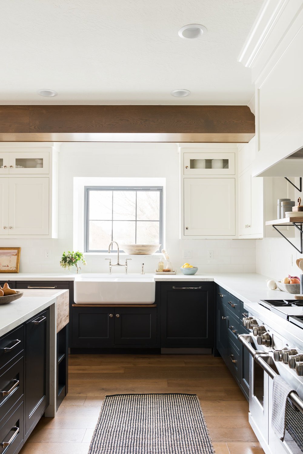
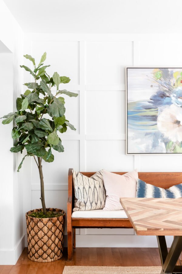
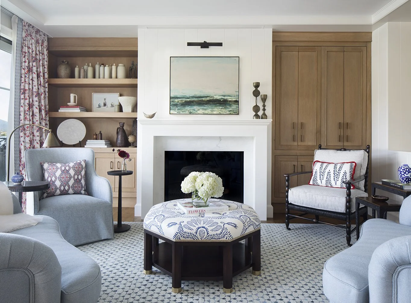

Photo Credits: 1) Studio McGee 2) The Happy Housie 3) Julie Rootes 4) Britt Design Studio
Accessible Beige by Sherwin-Williams
If you’ve ever wanted a warm neutral that isn’t too yellow, too gray, or too stark, Accessible Beige is the sweet spot. It’s soft, inviting, and endlessly versatile — a chameleon shade that shifts with the light. On cabinetry, it creates a subtle, elevated backdrop that feels classic without being boring.
We love it for mudrooms, pantries, or built-ins in living rooms where you want warmth but still need a timeless, neutral base. Pair it with brushed brass for a traditional look, matte black for something more modern, or natural oak accents to highlight its warmth.
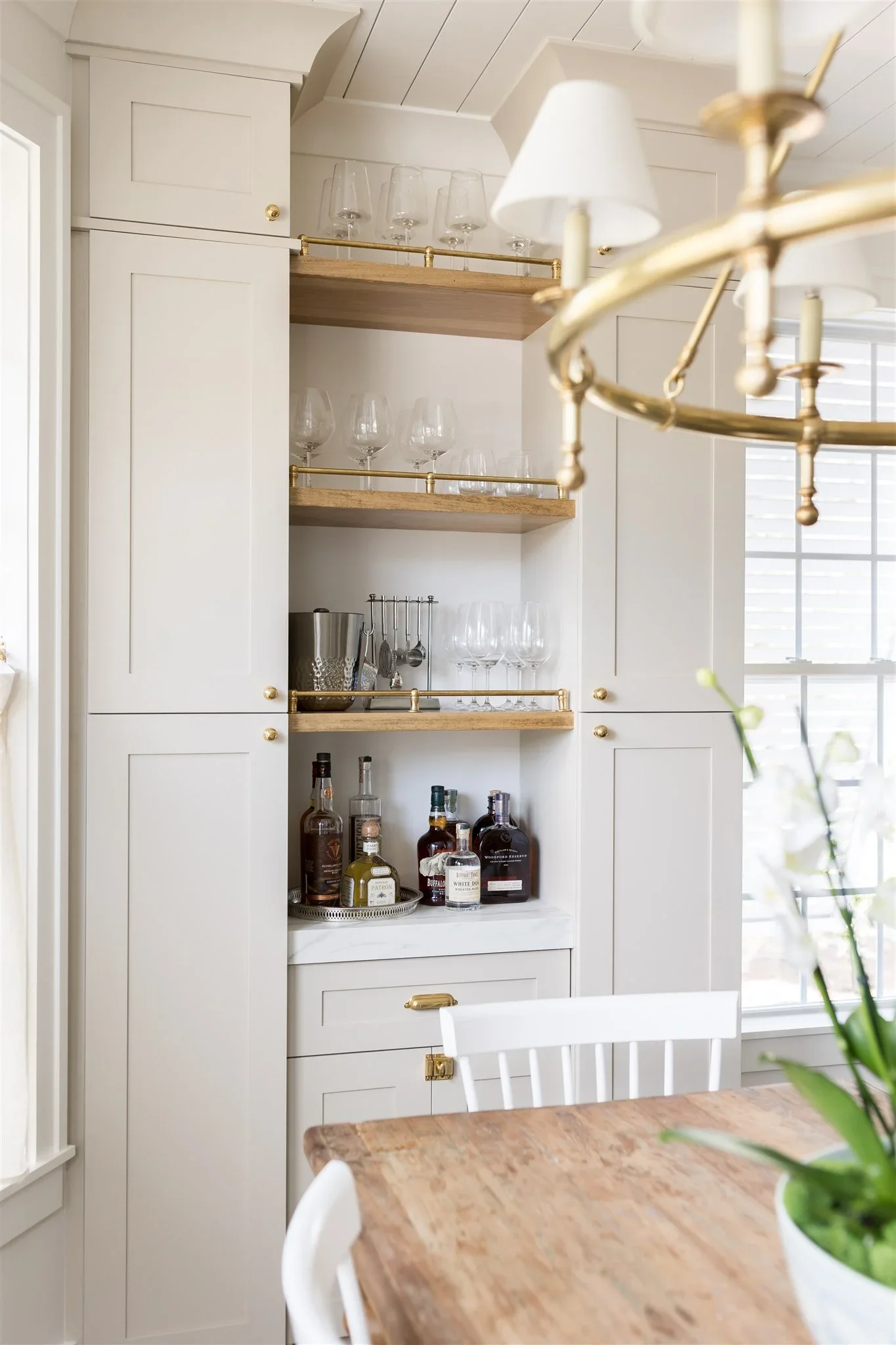
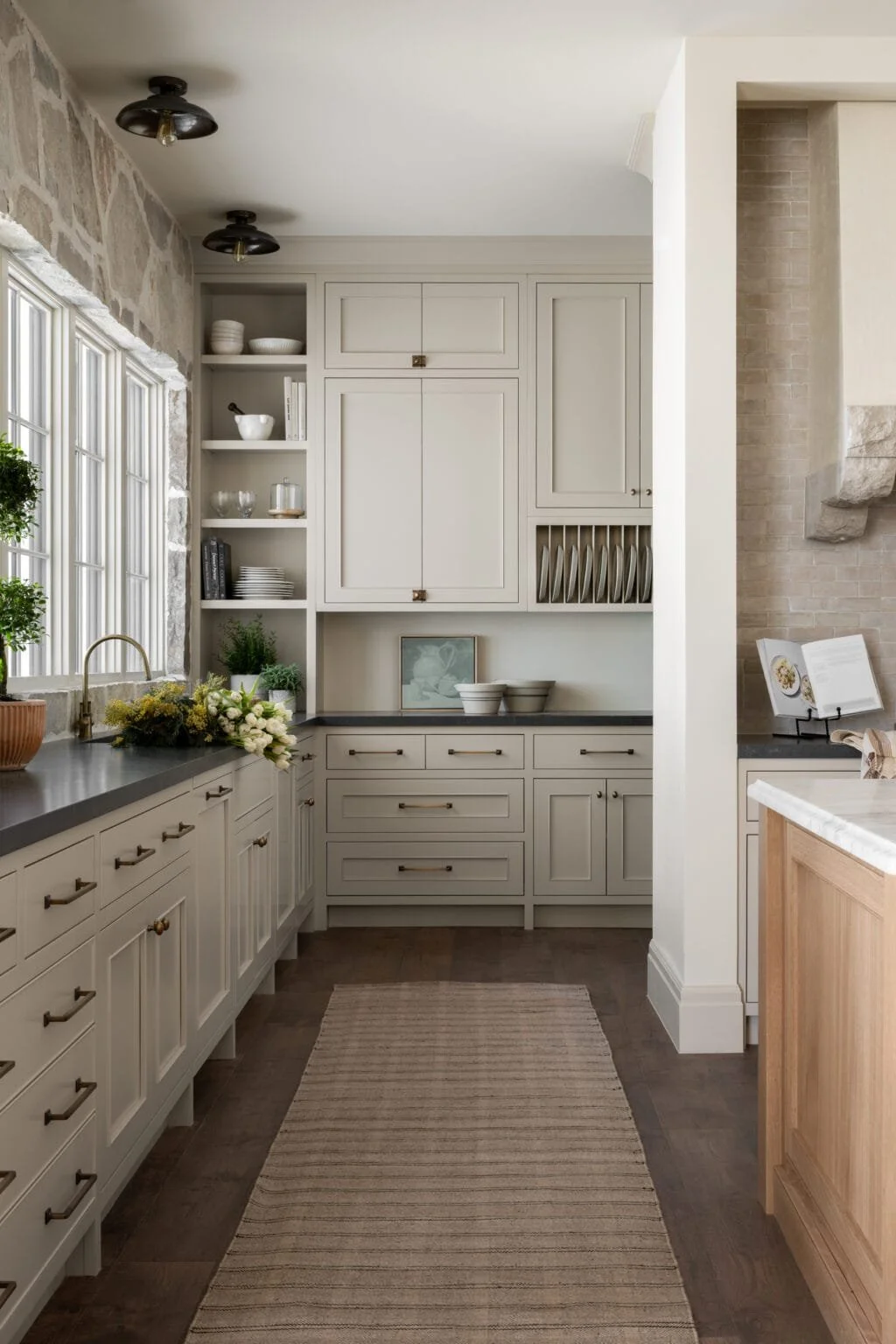

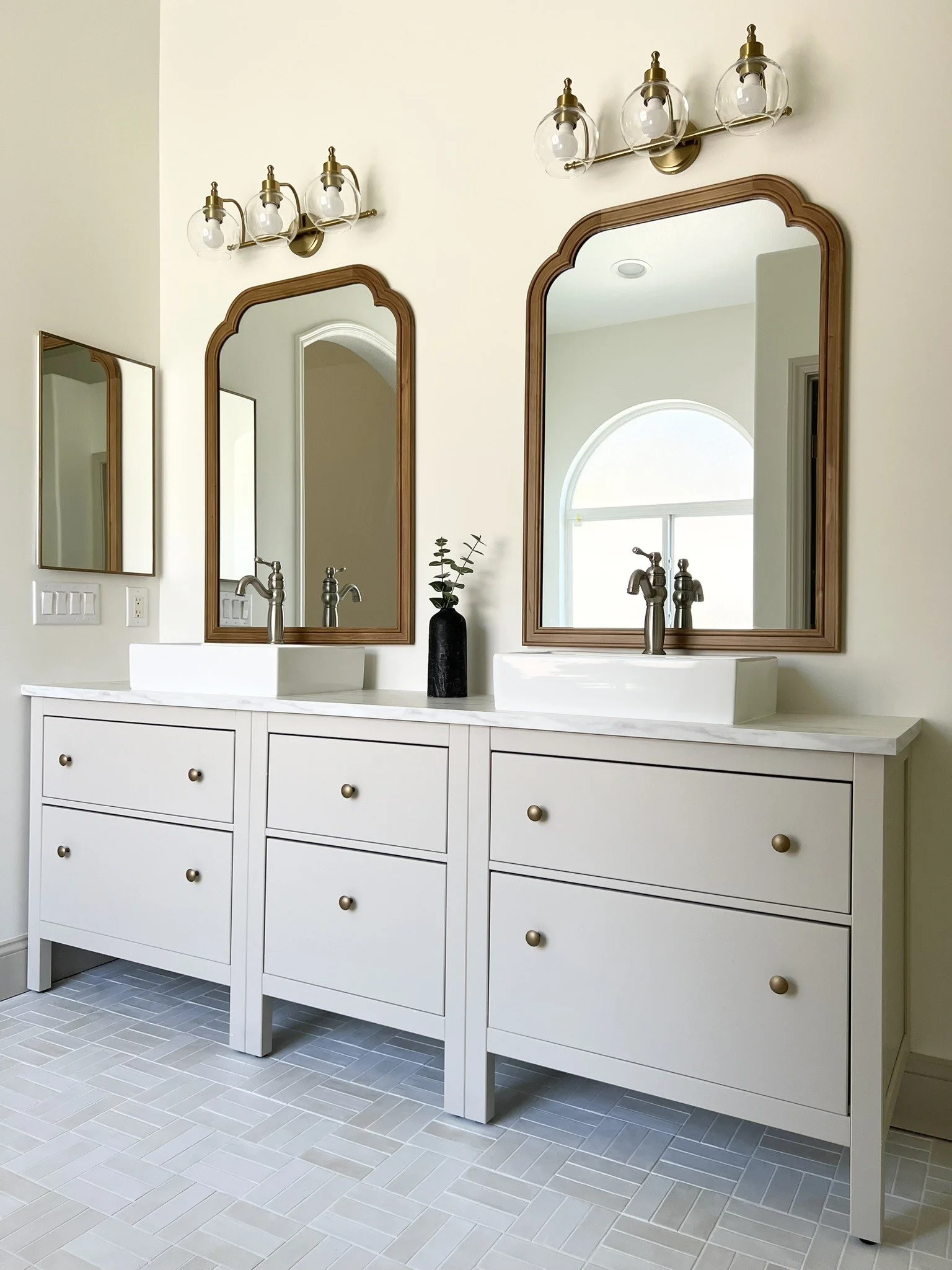
Photo Credits: 1) Caitlyn Motycka Photography 2) Studio McGee 3) Caitlyn Motycka Photography 4) Haus & Hand
Evergreen Fog by Sherwin Williams
If there’s one color that feels like a breath of fresh air, it’s Evergreen Fog. A soft green-gray with just the right balance of earthiness and sophistication, it’s both calming and versatile. It has enough depth to make cabinetry feel grounded, yet enough softness to keep it from overwhelming a space.
We love Evergreen Fog for built-ins in living rooms or offices where you want a touch of color without going bold. It pairs beautifully with natural wood tones, brushed brass hardware, or even sleek matte black for a modern edge. In a kitchen, it can bring warmth and character while still feeling timeless. It’s one of those shades that adapts to its surroundings, making it a perfect choice for cabinetry that’s meant to feel both elevated and approachable.
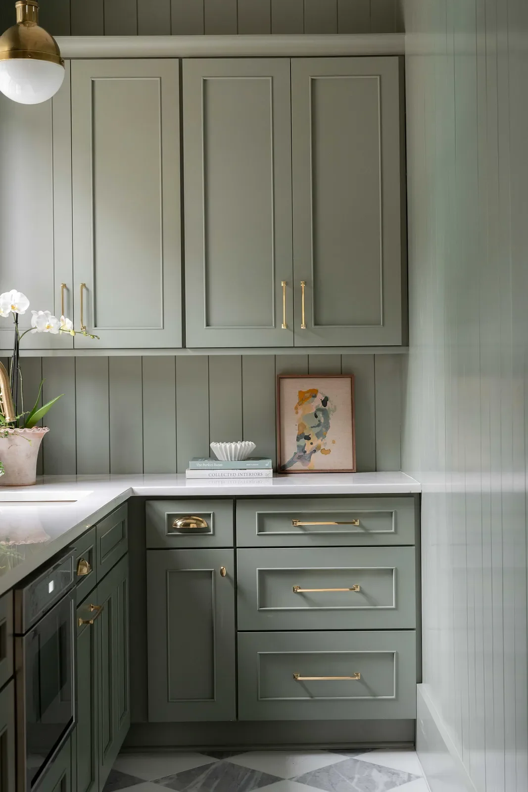


Photo Credits: 1) Source: Arc Interiors 2) Our Install 3) Carolyn Leona Design 4) West Haven Design Co
Tricorn Black by Sherwin Williams
When you want bold, timeless drama, Tricorn Black delivers. Unlike softer charcoals or muted blacks, this shade is a true black — striking, modern, and endlessly versatile. On cabinetry, it instantly creates a sense of sophistication and depth, grounding a room in a way few colors can.
We love Tricorn Black for fireplace surrounds, bar units, or built-in media walls where you want cabinetry to feel like a statement piece. It works beautifully with crisp whites for contrast, rich brass hardware for warmth, or even natural oak accents for balance. While undeniably bold, Tricorn Black never feels trendy — it’s a classic that makes cabinetry look intentional, elevated, and built to last.
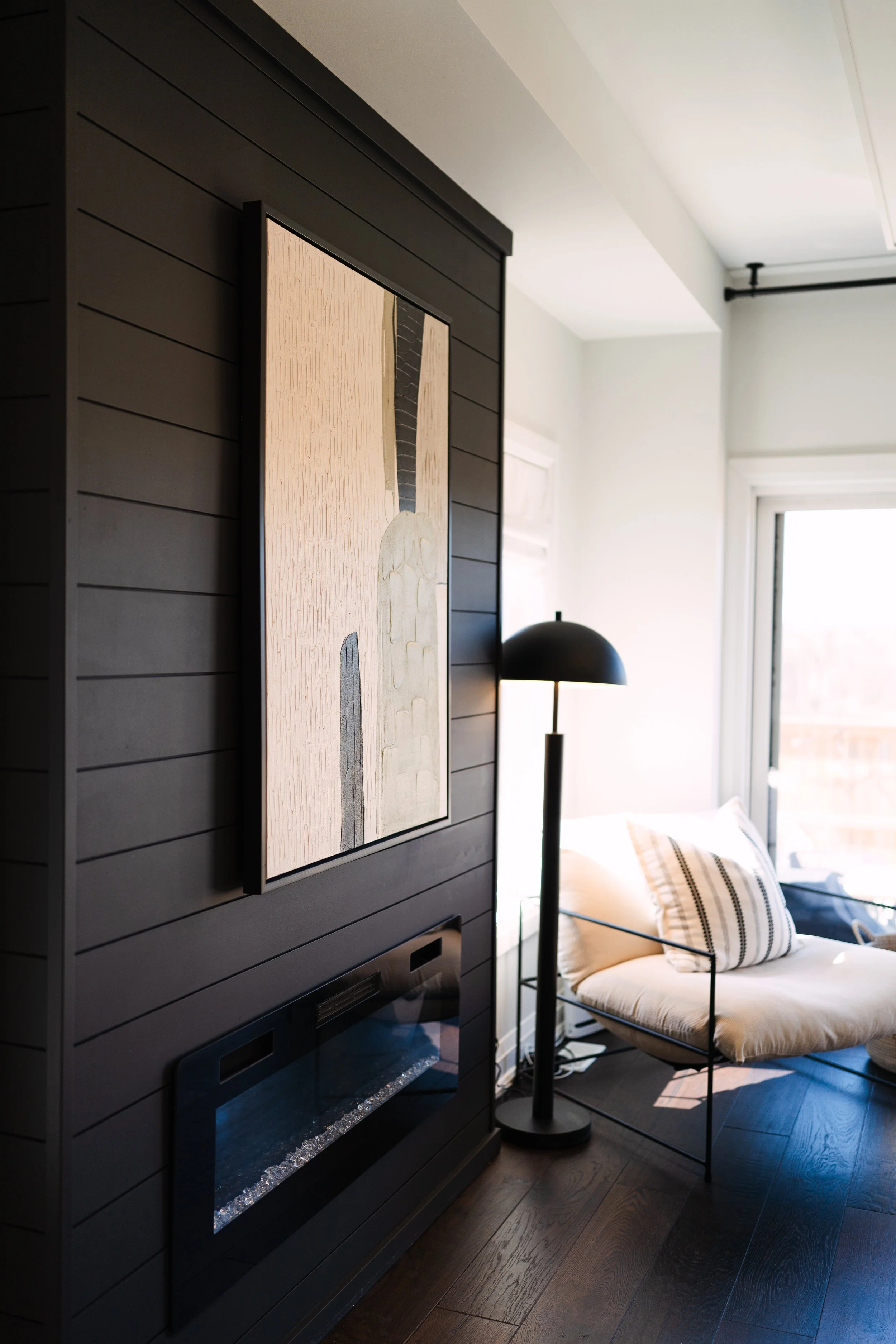


Photo Credits: 1) Our Install 2) The House Of Silver Lining 3) Papermoon Painting 4) The Identite Collective
How to Choose the Right Shade
When it comes to cabinetry, light and context matter. A bright white might feel perfect in a kitchen flooded with natural light, while a deeper green or navy adds coziness in a living room or basement. Natural wood finishes, on the other hand, add timeless warmth and work beautifully across mudrooms, offices, and dining spaces.
Closing Reflection
Cabinetry paint colors set the tone for your entire room. These shades have become staples in our work — from Cambridge to Toronto and everywhere in between — because they’re versatile, timeless, and bring cabinetry design to life. Whether you’re dreaming of something bold or subtle, modern or classic, the right paint can make your millwork unforgettable.